

We’ve been doing some work at Cosive to modernise the MISP user interface and bring more responsive web design into the experience. The result is a new beta UI that you can enable today if you’re running a recent version of MISP (v2.5.32 or later).
This update is driven by a simple goal: make MISP easier to use, especially for analysts working on smaller screens or remotely.
We took the time to contribute back to MISP because it's open source software that we use and recommend every day, both in our work as CTI practitioners, and as the maintainers of CloudMISP, our enterprise-grade MISP deployment.
Why Change the UI?
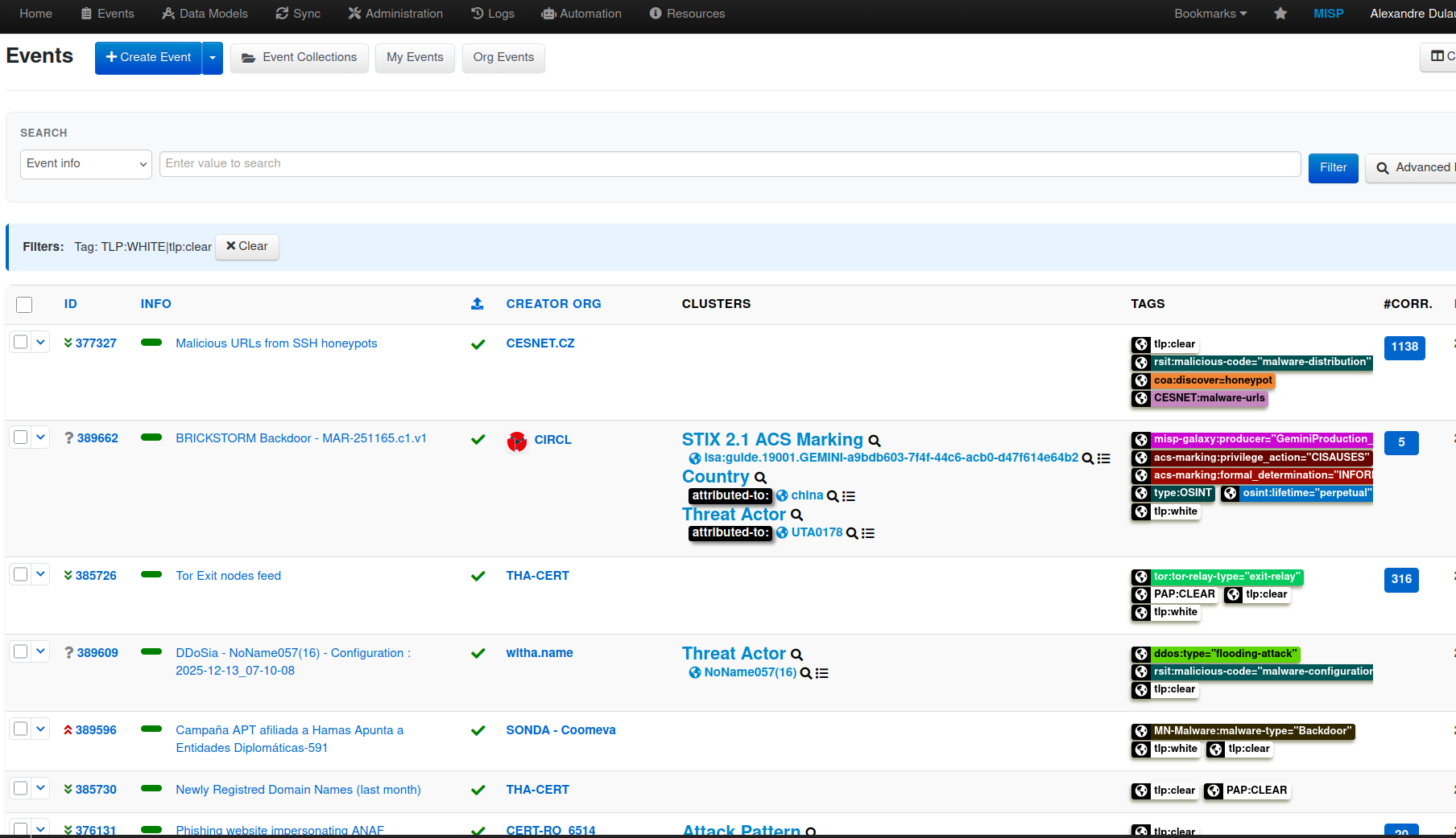
As analysts, we often work from laptops or remote setups where screen space is limited. MISP contains a lot of valuable information, but in the classic interface some of the most important details can end up off-screen.
For example:
- The event title (Info column), often critical context, may sit off to the right.
- Frequently used action buttons can also be hidden outside the visible area.
- High information density can sometimes make the page feel cluttered.
The beta UI addresses these issues by improving layout, reducing visual noise, and prioritising what analysts need to see first.
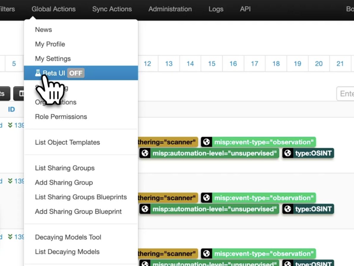
How to Enable the Beta UI
If you’re on a recent version of MISP (for example, 2.5.32 or later):
- Go to Global Actions.
- Click the Beta UI button.
- The new interface will load immediately.
This setting is per user, so you can switch back to the classic UI at any time without affecting others in your organisation.
What’s Changed?
1. Reduced Information Density
The new interface introduces more spacing and breathing room. The is to make the interface easier to scan and process without removing functionality.
2. Responsive Design
The layout now adapts more intelligently as you resize your browser.
- Event titles are positioned more prominently and shift leftward.
- Important context is visible front and centre.
- The interface adjusts cleanly across different screen sizes.
For analysts, that means less horizontal scrolling and faster orientation.
3. Action Buttons Simplified
Previously, many action icons were stacked along the right-hand side of the event listing.
In the beta UI:
- These actions are consolidated into a dropdown menu.
- Each option includes a label, making it clearer for users who don’t use certain features every day.
4. Highlight Tags for Focused Visibility
The classic UI included a column toggle (often overlooked) that allowed you to control which columns were shown.
The beta UI builds on this by introducing a new column: Highlight Tags.
Here’s how it works:
- Navigate to Tag Taxonomies.
- View the list of taxonomies.
- Select which ones should be marked for highlight.
Only those selected tag families will appear in the highlight column.
This is particularly useful if you want to surface only the tags that matter most to your workflow, for example:
- TLP
- Workflow
- Other key operational taxonomies
It reduces visual clutter and keeps the focus on what’s operationally important.
5. Streamlined Top Navigation
The left-hand navigation has been reworked into a more structured, hierarchical menu system.
There’s a design principle in UI/UX that suggests humans comfortably process around seven choices at once. The new navigation reflects that:
- Options are grouped logically.
- Menu hierarchy makes exploration more intuitive.
- Icons help users quickly identify categories.
For example:
- Tags and taxonomies are grouped clearly.
- Remote services and feeds are consolidated under data ingestion.
- Creating a new event is now more prominent.
- Import options (STIX, MISP JSON, free text, etc.) are easier to access.
The structure should feel familiar to anyone used to modern operating systems.
Switching Back to Classic
If you prefer the traditional interface:
- Simply disable the beta UI in your settings.
- The change applies only to your user account.
Teams can run mixed environments without a problem
What’s Included, and What’s Next
Currently, the beta UI includes:
- The Event Listing page
- The Navigation bar
Additional screens are in the works. The intention is to continue refining the interface and contributing improvements back to the MISP project over time, based on community feedback.
We Want Your Feedback
This is a beta release, and we're keen to keep iterating on and improving the changes.
If you enable the new UI, try it in your daily workflow. Let us know:
- What works well
- What feels slower or harder
- What would improve your workflow
MISP is a community-driven project. Improving usability helps everyone.
If you’re running a recent version, you can enable it today and see how it fits your workflow.